
Kry Livi and HA | Wisdom Wellbeing Partner to Bring Digital GP Access to Thousands of Individuals
Kry Livi and HA | Wisdom Wellbeing Partner to Bring Digital GP Access to Thousands of Individuals
Read more
Read the latest reports, features and news from our content library.

Kry Livi and HA | Wisdom Wellbeing Partner to Bring Digital GP Access to Thousands of Individuals
Read more

Livi UK and Scan.com Partner to Expand Access to Diagnostic Imaging Services
Read more

Livi Partners with CloudFit to bridge Healthcare and Holistic Wellbeing Through AI-Powered Preventative Health Platform
Read more
Read more
Read more

Read more
Read more
Read more

Almost two-thirds (65 percent) of UK adults over 65 want more choice and control over how they access primary healthcare services, such as opting between in person and video GP appointments, according to a new survey.
Read more
Dr Tom Davis, medical director and country manager at Livi, explores how greater efficiencies and embracing digital care can solve the GP workforce crisis.
Read more

Read more

Read more

Read more

Read more

Read more

Here our Country Managers share their thoughts on how companies like Livi can support the Government’s ambitions to reshape the NHS and what it will take to make it fit for the future.
Read more

Read more

Read more

Read more
Read more

Our UK Medical Director and Country Manager, Dr Tom Davis, explores how we can support the BMA’s strategy to Rebuild General Practice.
Read more

Read more

NHS healthcare manifestos must deliver the equity and efficiency of the commercial sector.
Read more

Read more

Read more

Read more

Read more

Read more
Read more

Read more

Read more

Read more

The cancellation or non-attendance of appointments at short notice remains a major challenge facing the NHS today.
Read more

Read more

Read more
Read more

Read more

Read more

Read more

Read more

Read more

Read more

Read more
Read more

Read more
Read more

Read more

Read more

Read more

Read more

Read more

Read more

Read more

Read more

Read more

Read more

Read more

Read more

Read more

With many practices facing an ongoing challenge to manage clinical capacity in the midst of rising patient demand, there are many different scenarios where a practice or PCN might consider utilising an external partner.
Read more

Read more

We unpack key digital workstreams and their implications from NHS England’s urgent care plan.
Read more

Read more

Read more

Following the recent announcement of a new series of nationwide dementia pilots to proactively screen patients in care homes, we look at how digital technology has supported dementia diagnosis and management over the last few years.
Read more

Read more

With the new year upon us, we take a closer look at the NHS’ recently published planning guidance and its key priorities for the health system over the next two years.
Read more

Read more

Recently, Livi reached a historic milestone serving its millionth patient here in the UK.
Read more
A report on increasing access, system-wide working and the benefits of digital inclusion
Read more

There are an estimated 1.2 million people living with diagnosed chronic obstructive pulmonary disease (COPD) in the UK today.
Read more

North Yorkshire CCG requested support from Livi to assist with winter pressures.
Read more

We recently sat down with Simon Lucas, Livi UK Managing Director, to discuss pressure points facing general practice this coming winter, and possible approaches to address them.
Read more

Declan Mullaney, Livi Head of Policy and Public Affairs, explores why ongoing demand challenges point to a need for long-term support for primary care in winter and beyond.
Read more

Digital hubs can be a release valve on pressure points in the health system this winter and beyond.
Read more

How organisations managed winter pressures to meet rising patient demand
Read more

Read more

Following the publication of the UK government’s Women’s Health Strategy, we explore key challenges surrounding the gender health gap and present how we’re working to address them.
Read more

In a guest article for Healthcare IT Today, Juliet Bauer, Chief Growth and Marketing Officer at Livi, explores challenges surrounding the gender health gap in the UK and how digital technology can support better women’s health.
Read more

We sat down with Dr Nikki Ramskill where she talks about how she became a digital GP and the improvements it's made to her work-life balance.
Read more

We recently interviewed Dr Nikki Ramskill to find out more about the day-to-day of being a digital doctor. Here’s what she had to say.
Read more
At Livi, we’re working to make healthcare more accessible to all, supporting NHS, private and employer organisations. Here are 10 reasons why Livi is a good choice for patients, partners and healthcare professionals alike.
Read more

Read more

How practices can take every opportunity to gather QOF points, and help to create more effective, efficient care.
Read more
Read more

Dr Bryony Henderson discusses how she copes with the pressures of being a GP and why taking care of those who give care is of vital importance.
Read more

Read more

Read more

Just as in traditional general practice, building a positive doctor-patient relationship is essential to a successful remote or digital consultation.
Read more

Technology has the ability to join up healthcare, creating efficiencies and reducing inequalities.
Read more

Digital accessibility removes the barriers that prevent interaction with, or access to websites, digital tools and technologies, by people with disabilities.
Read more

Read more

Read how Livi has supported Woosehill Medical Centre to meet growing patient demand and offer a blended approach to appointments.
Read more

Juliet Bauer discusses why a grounded approach to digital transformation in healthcare is vital for success.
Read more

We recently interviewed Drs Farah Virjee and Ewan O’Farrell on what it’s like to work as a GP at Livi. In our latest film, they share their views on digital working, appointments, wellbeing and more.
Read more

What’s it really like to work as a digital GP? We recently sat down with Drs Farah Virjee and Ewan O’Farrell to find out. In our roundtable, they share their views on the practicalities of daily life as a GP at Livi, quality of care, support and much more.
Read more

To help GP practices tackle current levels of demand, support is available via the GPRP. Our short explainer provides further information.
Read more

Read more

We take a closer look at the challenges facing general practice at a local level and the evolving role of digital technology.
Read more

Livi’s gender pay gap is closed, but should this really be seen as an achievement in 2022? Managing Director Juliet Bauer explains why this announcement is about transparency, not triumph.
Read more

Livi has supported Woosehill Medical Centre since January 2022. We recently sat down with the team to discuss their key challenges and experience with Livi to date.
Read more

Practices go to great lengths to ensure their surgeries are accessible to every patient’s individual needs. But do their websites offer the same support?
Read more

Read more

With Urgent Care services easing pressure on A&E departments it is important to continue pursuing efficiency and allocating capacity within Urgent Care.
Read more
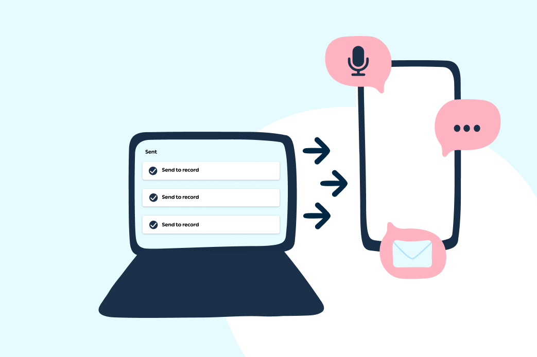
We discuss why we shouldn’t view tech with a one-size-fits-all mindset, and explain how collaborative partnerships, such as our Flagship programme help get the most out of digital tools.
Read more

For the second time, the planned transfer of CCG-commissioned extended access services to PCNs has been postponed by a further six months, until October 2022.
Read more

The pandemic has helped to accelerate new technology-driven approaches in primary care, but digital transformation must be at the heart of the government’s strategy for the NHS to continue to utilise new and evolving digital tools.
Read more

I’m pleased to announce today that Livi has acquired our long-term partner VIX Digital, bringing on board some of the most experienced NHS systems developers in the industry.
Read more

Read more